
Understanding The "Black Tax"
The devaluation of Black home ownership is very real and very destructive. Because of it, Black residents aren’t reaping the benefits of home ownership in the way that Whites do
Pete Saunders | Corner Side Yard

Over the years many Black folks have become familiar with some version of the term “Black tax.” It’s often mentioned when Blacks notice that, say, the cost of a product in a Black neighborhood is higher than in a White one. Others say it’s the money that well-off Black households give or loan to less-well-off families to cover bills and other expenses. But it can also be expressed as the price we pay for where we choose to live. Simply put, Black-owned properties are often devaluated and that plays a significant role in the nation’s racial wealth gap, as well as the ability of our metropolitan areas to reach their full potential.
I know that in an environment where the greatest complaint about housing in America is its lack of affordability, it seems odd to talk about communities with deflated values. But if urbanists are concerned about equity as well as affordability, it’s something that should be discussed. And I think addressing devaluation can play a big role in revitalizing cities and metros that haven’t been able to completely benefit from creative class hegemony.
What recently brought this to mind was an introduction to a series by Shelterforce that ponders the racial wealth gap, along with questions on the lack of success in closing that gap. Home ownership has been touted as a way to increase wealth. But what if Black wealth gain is always less than for Whites? How does the gap ever narrow?
Andre Perry of the Brookings Institution did some interesting research on the housing aspects of this over the last several years. His focus has been on the devaluation of Black-owned property in metro areas across the U.S., with those in majority-Black neighborhoods (for his study, ZIP codes where the neighborhood unit of analysis) having the greatest devaluation. This led to a Brookings report on the subject released in 2018, and a book called Know Your Price, published in 2020.
Perry’s analysis found that the majority-Black neighborhoods of metro areas across the nation were devalued, on average, by $48,000 between 2012-2016. That’s cost Black homeowners $156 billion over that period.
That’s staggering.
As you might expect, the devaluation varies by metro area. In New York, for example, Perry estimates that homes in majority-Black neighborhoods were nearly 10 percent less than they would be, when controlling for other factors like housing quality and neighborhood amenities. In San Francisco, homes in majority-Black neighborhoods are 27.1 percent less. In some mid-size metros, the gap is even larger – in Omaha, NE, it’s 43.5 percent, in Rochester, NY it’s 65 percent.
You can see the Brookings map showing the extent of devalued homes in majority-Black neighborhoods throughout the country …

I always believed his research didn’t get the publicity it deserved among urbanists or the general public for that matter. But I firmly believe that while Black homeowners are less wealthy because of this, our metro areas are also weaker as a result.
The Segregation Correlation
I did a very modest update on Perry’s work using a different approach. I wanted to see correlations, at the metro level, between Black/White segregation and housing price, and between metro level Black population and housing price. I used 2020 Census data at the metropolitan area level for the 56 metros with more than one million residents, gathering total metro population, Black population and median housing sale price. I also used the Census’ 2020 Black/White similarity index to see how metros compare in terms of segregation. My thesis was that increased segregation and increased Black populations led to lower housing prices.
What I found: For the 56 largest U.S. metros, there is a negative correlation between segregation and median sale price, and a negative correlation between a metro’s percentage Black population and median sale price.
I also found that as both segregation and the percentage of metro Black population decrease, the negative correlation increases.
This is even clearer when I split this into quartiles. The first quartile, with the highest Black/White dissimilarity index and highest Black population percentages, have some of the lowest median price values. However, the correlations are rather weak. Midwestern metros dominate the first quartile, but there are some significant outliers. New York, Boston, Washington, D.C. and Miami stand out as being both segregated and expensive. See here …

Second and third quartile metros are mostly a blend of slightly less segregated and affordable metros located largely in the South, with a handful of metros dotted in other regions. The negative correlation between Black presence/segregation and housing price grows …


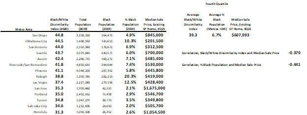
The fourth quartile, the least segregated and with the smallest Black populations, tend to be expensive Western metros. Only three of 14 in the group (Oklahoma City, San Antonio and Tucson) have median housing prices below the national average of $361,700 …
This analysis suggests that Black residents aren’t reaping the benefits of home ownership in the way that Whites do, irrespective of where they live. Blacks see lower housing values in the places where they are in their greatest numbers and most segregated. Blacks are fewer in number and less segregated in expensive metros, suggesting high barriers of entry. This has an impact on economics at the metropolitan level, and I hope it garners the attention it deserves.